Showing posts with label front. Show all posts
Showing posts with label front. Show all posts
Monday, 13 April 2015


Thursday, 19 March 2015

Tuesday, 10 March 2015
Feedback From Target Audience
In class we printed off our draft front cover, contents page and double page spread. This was important to do as we needed to all see our drafts as hard printed copies, I think even from printing it out I could already tell what I seriously needed to change.
From here as a class we all walked around and gave feedback to each persons work on things that were good or that needed changing, I made sure that I took a picture of the feedback that I got from my peers and thought it was essential to put up on my blog!
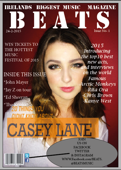
This is my draft FRONT COVER
The feedback that I got from this image was.
These are the changes I need to make to my front cover:
- The background needs to be edited, as the pink doesn't look right
- Her head has been cut off at the top, therefore I need to make the picture longer
- I need to use a much smaller barcode, as this one takes up most of the page.
- As well as the barcode I need to make the icons much smaller.
- I need to make the image much clearer.
- The "Ireland's biggest music magazine needs to be a different colour.

For my CONTENTS PAGE
Unfortunately I couldn't print out my contents page in colour, which meant that it didn't look as well as It could, that being said I did manage to get some good feedback from my target audience.
- More images need to be put on the page
- There is too much space around the page (lots of white) therefore I need to put in some extra things to fill up the page.
- Different fonts should be used throughout the page
- More colour needs to be added- colour should be added to the background
- I need to add more images of different people and different things to the page

For my DOUBLE PAGE SPREAD
As for my Double page spread, I knew that it was still In a major working progress, therefore it didn't look as good as I had wished for the first draft, my audience feedback said:
(what I'm going to change)
- There is too much white space around the main image
- More text to be put on the page
- More colour and Images and different font to be used
- Drop caps to be added


Wednesday, 25 February 2015
Changing My front cover image
As my front cover image that i want to use was in a landscape image it wouldn't fit properly on an A4 page.
I have had to make some drastic changes to my over all image, for example; strectching the image out to be longer, the other changes that i want to make to this image is changing the masthead from the side to the top of the page.

Friday, 13 February 2015
Front Page Draft 1
For the first draft of my front cover I decided to keep the picture that was quite plain and simple, this was one of the pictures that seemed mostly popular compared to my other pictures, therefore I chose it to be my first draft front cover.
With the use of Photoshop on this image I have been able to create an eye-catching image that was originally a very plain and quite bland image.
I used this picture to edit on Photoshop as I felt it was most helpful with this particular image.
that being said, I feel as though this image was still very plain I could have made a lot more effort with the text surrounding and as well as the icons such as the "twitter, Facebook, Instagram" app icon, the barcode issue number and the date, therefore I decided to spend more time on my second front cover and add these into it.

The changes that have been made image to image are very slight and mostly unnoticeable, for instance, the difference between these two images are, I made the saturation higher and the girls hair seems more highlighted. as well as this I added some text around the image.

The changes between these two images are quite noticeable as the bottom one is the original image with just flash, it is clear that in this image the girls red lipstick and light brown hair isn't bright and really doesn't make a statement, therefore I decided that I wanted to make this image as bright as possible without making the face look to pale against the red lipstick and hair colour.

Tuesday, 27 January 2015
Using Photoshop
For my first and second draft of my front cover i decided to use "PHOTOSHOP" instead of "INDESIGN" my reasons for this was simply because I preferred photoshop as it seemed to give more options for my colour scheme as well as text, i tried to work with indesign and did my first draft on it, but later descovered that i wanted to redo it on photoshop to see if it would possibly turn out better, i did so and was much happier with the result, however i will definitely use indesign for the contents and double page spread.
Thursday, 13 November 2014
Music Magazine Research- Q Magazine Front Covers
Q Magazine Front Covers
I wanted to see the typical house- style of Q magazine, I decided that It would be good to make a collage of Q magazines front covers together to get a good idea of what I should be talking about when I come to analyse the latest addition of Q.

Tuesday, 21 October 2014


Friday, 17 October 2014

I decided to take to facebook, to finalise the pictures I will be using on my front cover and my cover page, my reason for this particular social media site was because it is quick and easy to put a number of pictures into one file, then to "tag" peoples names so they could see instantly what I wanted them to do, I "tagged" 20 people to either "like" or "comment" under the pictures that they thought was best for my magazine, the people that I "tagged" in my post were all students in my year, my reason for this was clearly because the magazine will be published and they will be the ones getting it, I thought this website suited my task perfectly, and I am happy with the amount of feed back that I received!

This is an example of some of the feedback that I got off facebook, this was the highest number of likes that I received from all of my pictures, although originally I wanted my front cover picture to be just two girls standing in-front of the school building, I decided to play around with different angles and positions for the girls, and I opted for this, I decided that this picture will be the main image on the front cover as the audience has clearly shown that they think this would look best for it.
Subscribe to:
Posts (Atom)